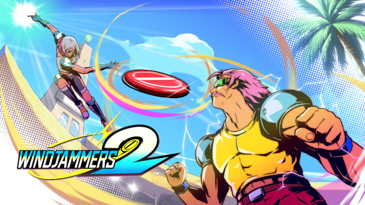
Windjammers 2 features five courses from the original game. The one course that didn’t make it is Concrete, but this sequel adds five brand-new courses to make up for it.
While both games are still pretty fresh in my memory, I’m going to walk you through all five of the maps that made it over from the original and compare them with their Windjammers 2 counterparts. So let’s dig right in!
Beach
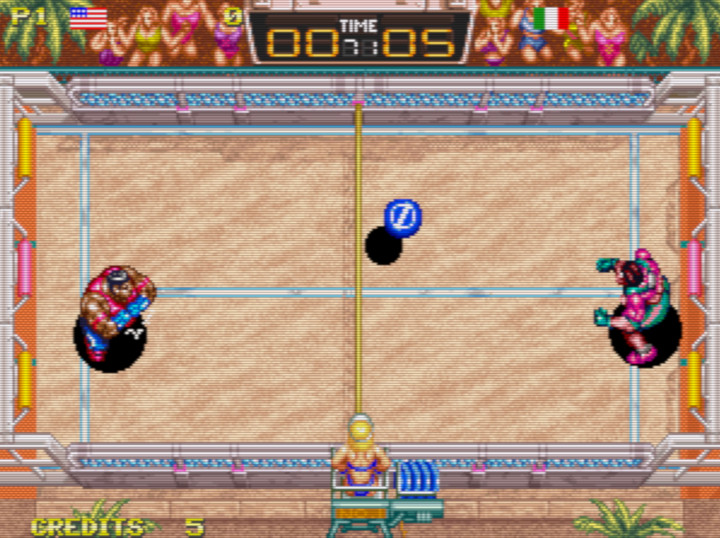
Beach is a true classic. When you think of the sheer ’90s-ness of the game, the beach-body vibes on display here fit right in.
I really like the crowd in the new version of this map, and I especially love that little ice-cream-cone dude that’s dancing in the corner. I also appreciate how the wider screen allowed for some extra detail. However, I did actually really like the pixelated look of the sand in the original, and I’m not a fan of how there’s a palm leaf covering part of the left-hand goal.
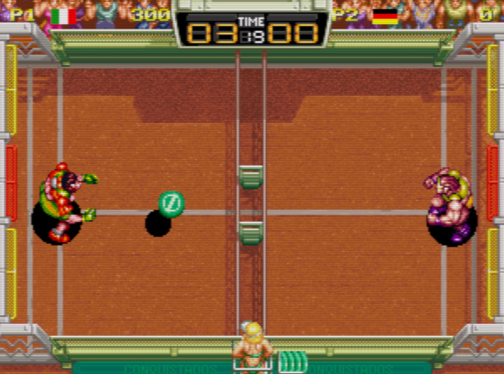
Lawn
I don’t know why exactly, but I’ve always really liked the aesthetic of the Lawn map. However, like the sand in Beach, I think the grass looks a lot better with pixel art. It just has the right amount of texture, I think.
But I still really like those lawnmower lines on the course, and I appreciate how the goal sections are painted rather than marked with foam bumpers. It makes it so much easier to tell which section of the goal you’re shooting at.
And DotEmu managed to toss in a Data East banner on the left-hand side here. In case you’re unfamiliar, Data East is the studio that developed the original Windjammers. This feels like a loving tribute to the folks who made the first game, and it’s a nice little touch here.
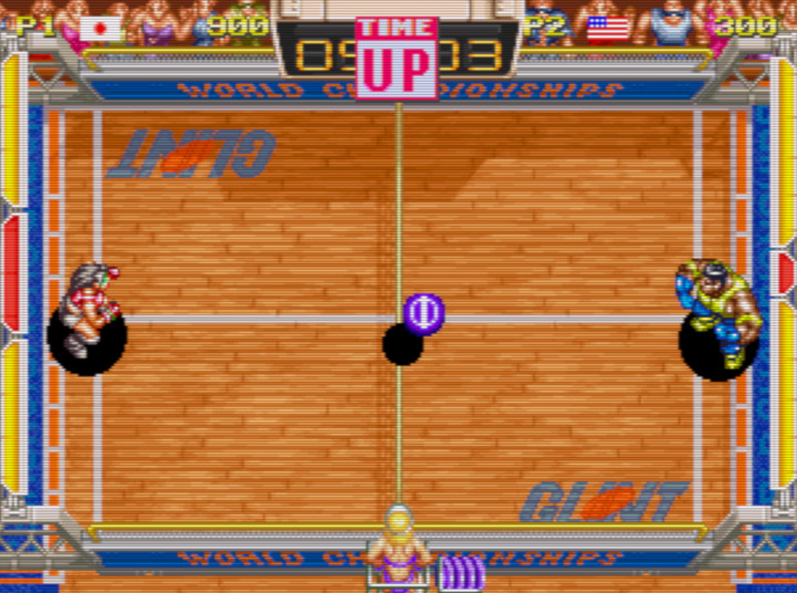
Tiled
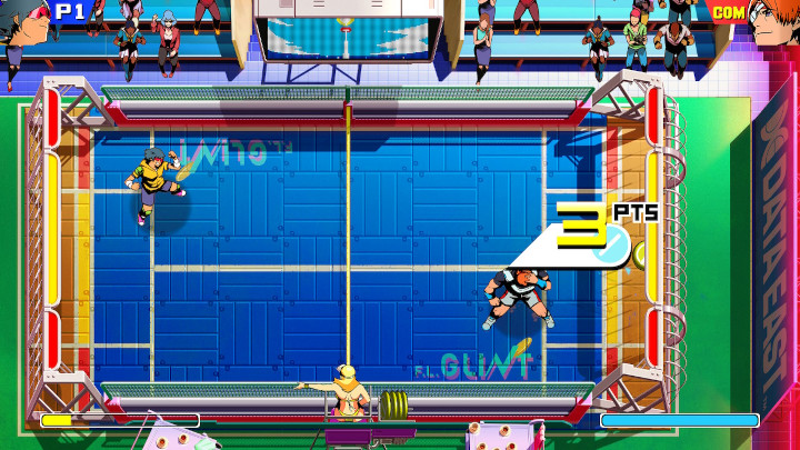
Where the pixel art really brings out the texture of the sand and the grass in the previous maps, it kind of makes the Tiled map look a little sloppy. So a modern cleanup really makes this thing shine. I’m not sure why the crowd is so sparse in the new version of this map, but I do love how DotEmu managed to get another Data East banner into another course.
And what are those things on the bottom? Are they refreshment carts?
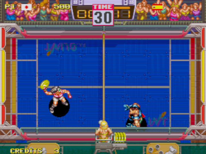
Clay
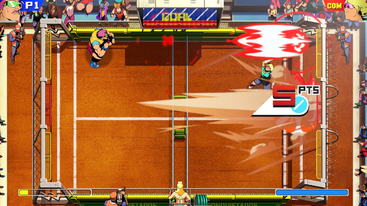
Clay looks absolutely awesome now, and part of it is that DotEmu was able to re-create that textured look of the pixel art while also increasing the visual fidelity. It gives this course a best-of-both-worlds visual appeal that I really dig.
I also like how you can now see more of the crowd surrounding the course, making it feel like a bigger event than it did before.
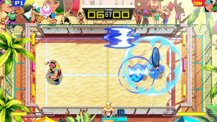
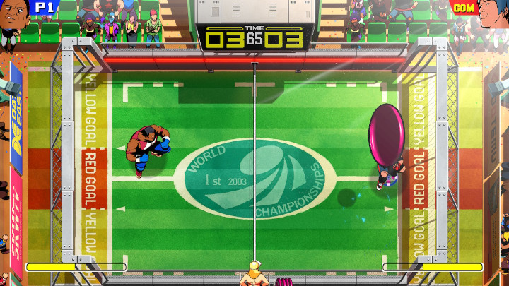
Stadium
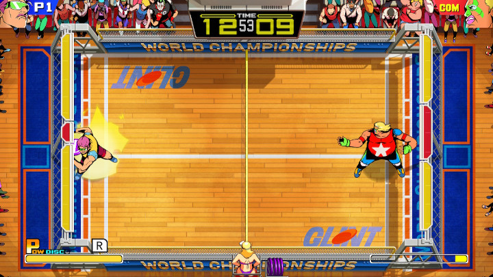
Like Tiled, Stadium really benefits from a fresh coat of paint. You can practically hear the squeaking sneakers on the hardwood floor just by looking at the above image. Sure, it’s a simple design, but it’s a really appealing one.
I should point out here that this map features a gimmick where the red section of the goal gets bigger the longer you go without scoring. That’s why the red/yellow balance is different on both sides of the course. It’s a fun gimmick for a map that’s essentially designed to be the game’s grand finale. It worked back in 1994, and it works here just as well.