Outbreak: The New Nightmare is billed as a throwback to an older and simpler time, a time when games like Resident Evil 2, with its clunky, tank-like controls, ruled the roost of the survival horror genre. But I think developer Dead Drop Studios took the “clunky” part of that equation to heart when making Outbreak: The New Nightmare, and they threw out so much of what made the Resident Evil games great.
One thing that I find particularly troublesome is the game’s menu. I used to work in UX, so I know a thing or two about designing menus. I can say with some measure of credibility that the menu in Outbreak: The New Nightmare is an absolute mess.
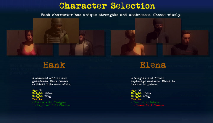
First of all, before you drop into the game, you’re confronted with this:
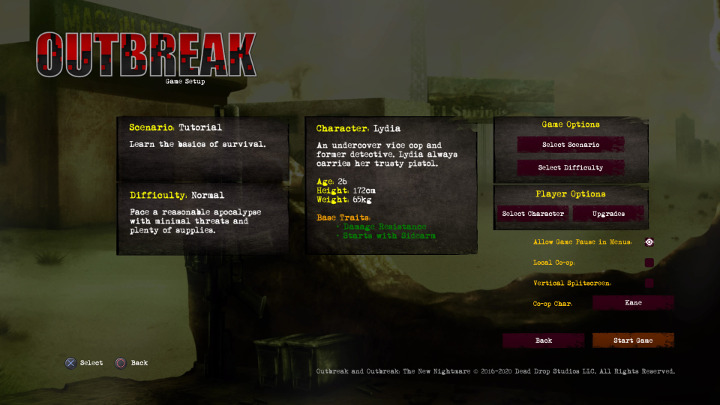
I won’t go into too much detail on this first nitpick, but it’s worth pointing out that, if you ignore the fact that the games’s logo text is red and black, there are four font colors. When you add the logo colors, that makes six. That’s too many.
More importantly, this menu is way too text-heavy, and it’s not good at connecting pieces of information that are related to one another. As an example of how disconnected this is, you can see the selected scenario on the left-hand side of the screen, yet the button where you choose the scenario is all the way on the right, in a separate box. Having played the game, I now know that those two things are connected, but users who are firing up the game for the first time probably won’t figure that out without some fidgeting.
In fact, I was a couple hours deep into the game before I even figured this out. When I chose a character, it felt like I was flailing in the dark a bit, because my character selection didn’t show up anywhere close to where I had made the selection.
What’s even more baffling is that in a small section beneath this, the menu actually makes some sense. The place where you select your co-op companion is how the rest of the menu should act. You can select a character, and your choice immediately appears in the same box as where you made the selection. It responds to your choice and gives you instant feedback to let you know your choice has registered.
Now, almost all of the relevant info is in this part of the menu:
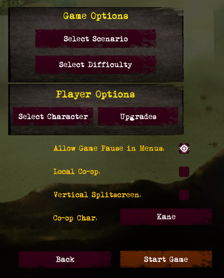
You could literally get rid of two of the menu’s three columns and you’d already have a better menu. You’d still need to tweak it a bit, but this is a much better place to start than what’s currently in the game. I would just be sure to indicate here that the player’s selections have been activated (so, “Select Difficulty: Normal” would be displayed instead of just “Select Difficulty”).
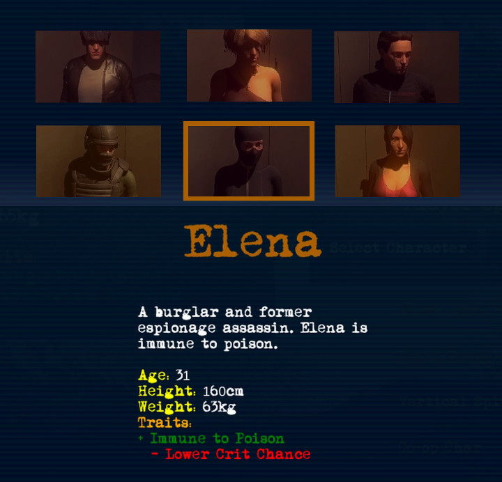
That information about the character? You don’t need it. When you hit the character select button, you end up here:
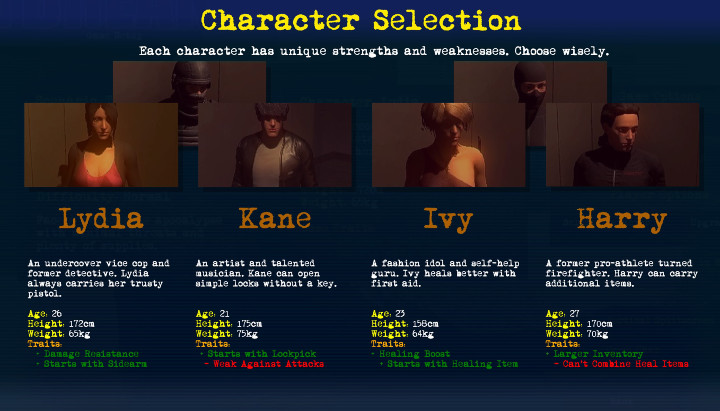
It makes sense to put all of this information in this menu. This is where players will need information about the character they’re choosing. You don’t have to repeat all of this information back on the previous menu.
Of course, I would change this too. I don’t like how there are four characters displayed, with two characters sort of hanging out in the back. If you move the cursor over one of those characters, the menu puts the back row up front, like this:
That’s such a bad experience, and it’s unnecessary. If you removed character information from this page, you could clean it up. Here’s a super rough, terribly ugly protype that I whipped up:
This shows the very rough draft of what I would do if I were tasked with redesigning this menu. All you would need is something to let the player know which option is selected, which I’ve represented with an orange box around Elena’s portrait. The character information would only be displayed if that character’s portrait was selected. Perhaps I would add a box to this panel that says “Choose Elena” or something like that, and some visual indication on the character portrait, like a checkmark or something, that lets players know which character is selected (versus which one the cursor is over).
Also, there are literally six font colors here. That’s three times as many as this menu actually needs.
If you think the problems end once you start the actual game and leave this menu behind, think again. During gameplay, pressing the circle button (if you’re playing the PS4 version of the game) brings up this menu:
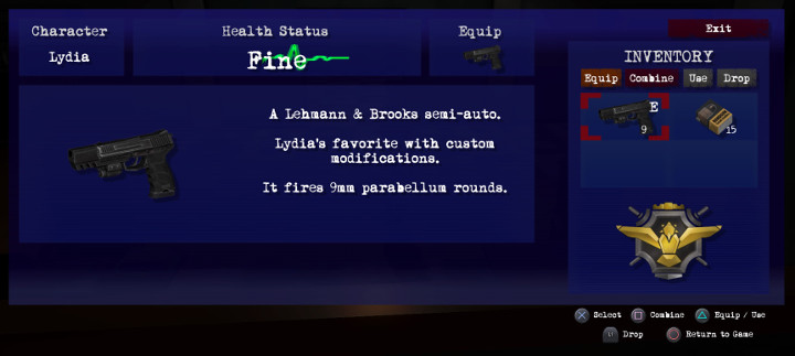
With every item, there is an option to Equip, Combine, Use, or Drop the item, which you can select from the menu (I’m assuming this was designed with a PC user in mind). You can hover over the desired option and press X to select it. On top of that, there are button prompts for doing each of those things as well, which seems unnecessary.
I would normally complain about the vague “Fine” with a green line for a health indicator, but this is a throwback to the PSOne-era Resident Evil games, which did the exact same thing. It would be nice, of course, to see some indicator of your health without having to go into a menu.
The biggest mistake that this menu makes, though, is it excludes an option to view the game map. If you’re playing the game on PS4, pressing the circle button will show the menu I displayed above, and pressing triangle will bring up the map. There is no way to toggle between these two things, and they take up two face buttons.
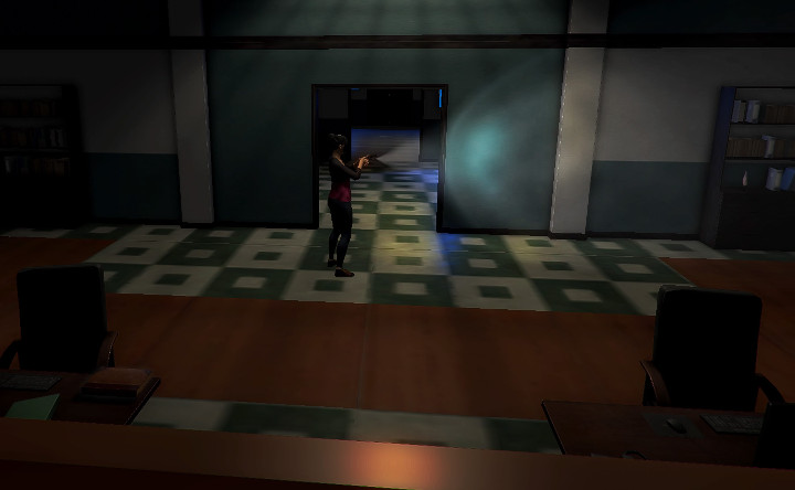
Why isn’t triangle just the menu button (or even better, clicking on the touchpad), and then R1 and L1 can toggle between the map and the inventory? This is what I would have expected, and I’m guessing a lot of the game’s console players would have also guessed that it would work this way. Because two of the face buttons are menu-related during gameplay, I find myself pressing the wrong one just as often as pressing the right one. My muscle memory can’t attach itself to a menu button, because there are two of them.
On top of that, in gameplay, the square button doesn’t do anything (well, that’s not entirely true; it will fire your weapon if one is equipped, which is also mapped to R2 — so you can either fire with square or R2). As is, you have to open the menu to manually reload (you will automatically reload if your clip empties). Why couldn’t square be a reload button? That would certainly make combat feel just a little bit more intuitive, which would be an improvement here.
Now, maybe the most baffling menu choice of all is the death screen. I’m pretty sure my jaw dropped in disbelief when I encountered this the first time.
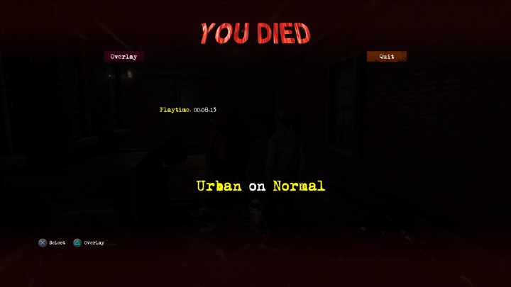
When you die, you get the “You Died” screen. Okay, that’s pretty normal. It shows you the stage name and difficulty setting, and also your play time (which frustratingly keeps ticking up after you’ve died — this should stop the second you died so you can get an accurate indication of your play time).
What’s incredibly not normal, though, is that you can toggle the overlay. What’s the point of that? I have no idea, but you can do it. Perhaps this was designed for co-op, so you can spectate your player after you die? I haven’t played co-op, so I can’t comment on that. But what I can comment on is that this is super confusing when you’re playing alone. Plus, there’s a button at the top for toggling the overlay, but you can also toggle it using triangle. So you have not one but two options for how you want to trigger this completely useless feature.
As someone who used to design menus for a living, I’m finding problems with every single menu in this game. And these aren’t minor nitpicks; some of these are frustrating to the point where the game becomes tedious because of them. You spend a lot of time in menus in this game, and some streamlining could really make this a better experience overall. I can only hope that this sort of streamlining ends up on the development roadmap for this game, and for the Outbreak series in general.